This case study is password protected


Context
In February 2025, the FDA announced that semaglutide (the active ingredient in Ozempic and Wegovy) would be removed from the drug shortage list on May 22.
AgelessRx is a telehealth longevity platform. Compounded Semaglutide was one of our top products, but it was only offered as a monthly subscription. This impending regulatory crisis gave us just three months to adapt.
Timeline
February - May 2025
My Role
Initially the sole product designer, I was responsible for user research, testing, design, and visual QA.
Tools
Figma, Figjam, UserTesting, Miro, Statsig
Team
Product Managers, Development, Operations, Marketing, Customer Experience, Legal
Challenge
With looming regulation changes impacting one of our top products, we were faced with two key business challenges:
Immediate: How do we maximize new customer value while we can still offer the product?
Looming: What happens to our ~4K existing monthly subscribers when we can no longer fulfill their prescriptions?
To address these challenges, we decided to test out new bulk subscriptions (3, 6, and 12-month plans). I would need to rapidly design, test, and validate this concept to address both challenges — first testing with new customers, then deploying to at-risk existing customers before the FDA deadline.
01
Discovery
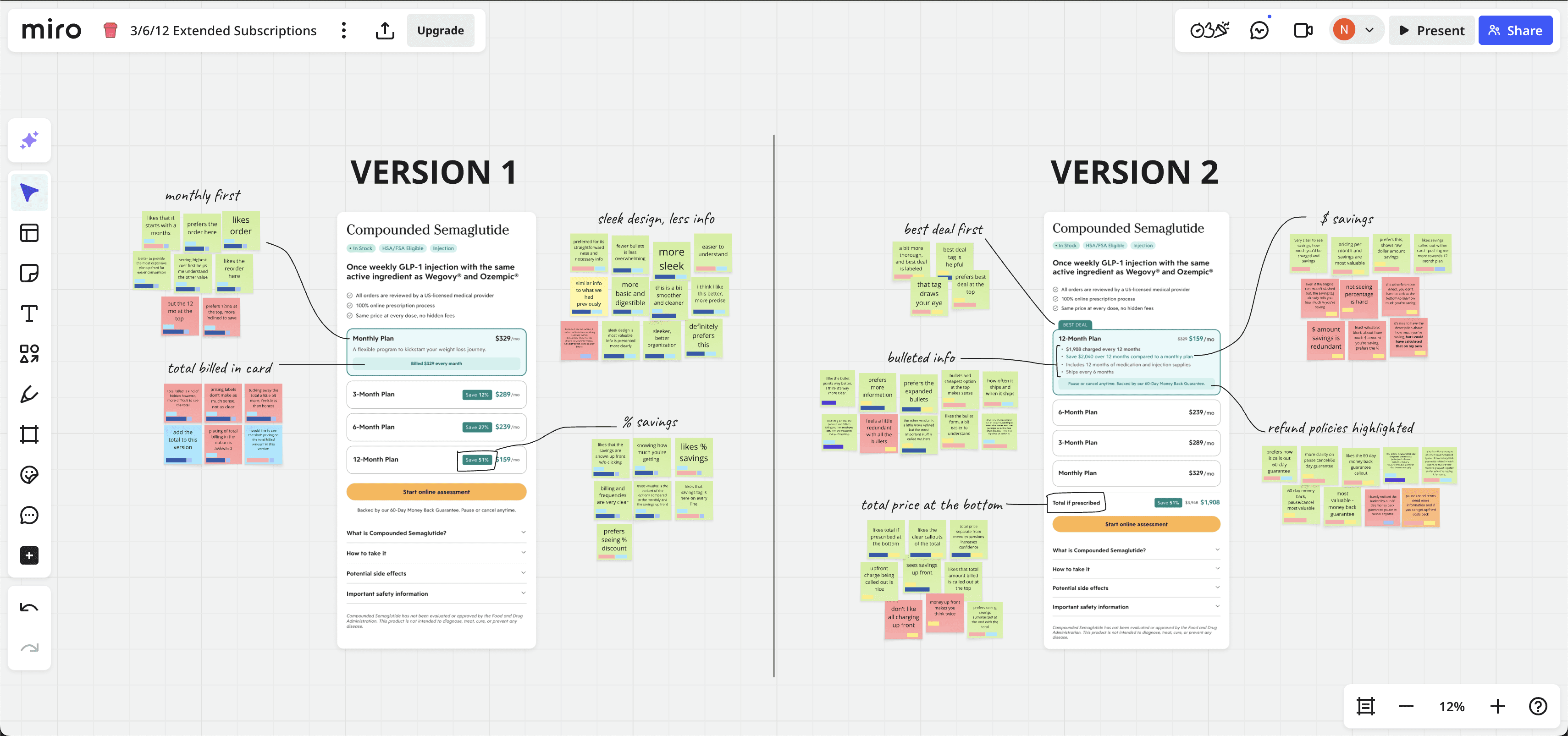
Competitive analysis
Several competitors already offered extended plans, so I quickly analyzed how other brands were presenting this offering, including: Henry Meds, Hims/Hers, and Eden.
We used this research as a starting point to guide what kind of content and patterns we wanted to test, as well as to start defining a competitive pricing strategy.


Leveraging design system investments
As the company’s sole product designer, I'd spent the previous 1.5 years building AgelessRx's design system from the ground up. Leveraging this investment in a flexible system, I was able to get working prototypes built and tested in under 2 days using our existing components and patterns.
These prototypes would help us quickly address multiple questions and hypotheses, including some learnings we had carried over from previous pricing experiments.
Rapid user testing
Alongside my PM, we set up an unmoderated study in UserTesting to get feedback on the two designs. I set up specific audience criteria based on target income levels and interest in prescription weight loss solutions.
Through testing, we identified some clear next steps, as well as business issues we would need to solve:
Bullet points worked — users wanted to see all the details
Displaying savings as % was easier to understand than $
Users wanted to see the total billed at the bottom
Our refund policies wouldn't work for longer plans
This research became the foundation for everything that followed.
02
Design
Applying research insights
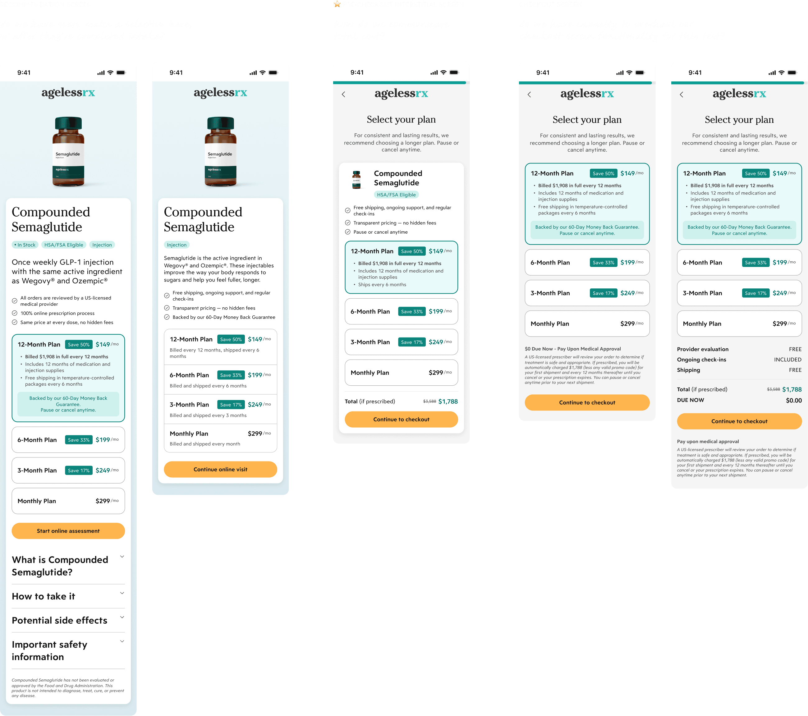
Based on our learnings from user testing and evolving business requirements, we decided to move forward with a combination of the two designs:
Show % savings badges
Keep savings visible without needing to click
Use bulleted lists to convey key details
Auto-select the 12-month plan at the top of the list
Highlight the total charged at the bottom
As I updated the designs based on user testing insights, I also explored where it could fit into our intake flow. Ultimately, we decided to position the selection decision right before checkout. This would allow us to run a clean A/B test against the control without the added lift of a custom checkout page.
Navigating operational chaos
As I refined designs, operational constraints kept shifting. These constraints meant frequent design iteration, but once we got key decisions nailed down, I was ready to ship to development.
Pricing
My PM worked with our Operations teams to strike a balance of profit margins, competitive rates, and allowing for simple mental math
Billing cadence
Leadership debated quarterly vs. biannual billing based on supply guarantees, chargeback risk, and mass refund risks if supply ran out
Supply chain risk
We would have to onboard a new pharmacy with complex integration requirements to support 12-month plans, and even that wouldn’t be a 100% guarantee
Refund policies
We worked with Legal and Customer Experience to refine refund policies for extended plans
03
Phase 1: Acquisition
A/B testing rationale
We wanted to A/B test this new experience to verify if the expected drop in unit sales would be offset by the expected increase in average order value (AOV) — basically, would this pricing model actually be more profitable?
The new experience was deployed as an A/B test (50/50 split) from March 18-April 14. All users were advertised a $149 starting price, but the control group was routed directly to the 1-month plan, while the variant group chose between 1, 3, 6, and 12-month subscriptions.
The result: an overall success
✅ What worked
Overall, extended plans proved to be both popular and more profitable despite an expected decrease in conversion.
3.5X increase in average order value
+$59K revenue lift during the 4-week test period
59% chose an extended plan, validating demand
❌ What didn’t
1. Conversion drop-off
Despite the experimental design being more profitable, we were concerned about a sharp decrease in conversion — billing page drop-off increased by 20%, and sales volume subsequently decreased by 28% (almost double what we’d expected).
2. (Overly) popular 12-month plans
Since we couldn’t guarantee fulfillment past 6 months, our 12-month plan had to be billed in 6-month installments to reduce risk of chargebacks and refunds.
As a result, the 12-month plan actually had a cheaper up-front cost than the 6-month plan, and was seeing a 36% take rate (7x higher than we’d anticipated). Unfortunately, it also had the lowest profit margin. Meanwhile, the 6-month plan had the highest LTV, but saw lowest take rate at only 11%.

Cross-functional design iteration
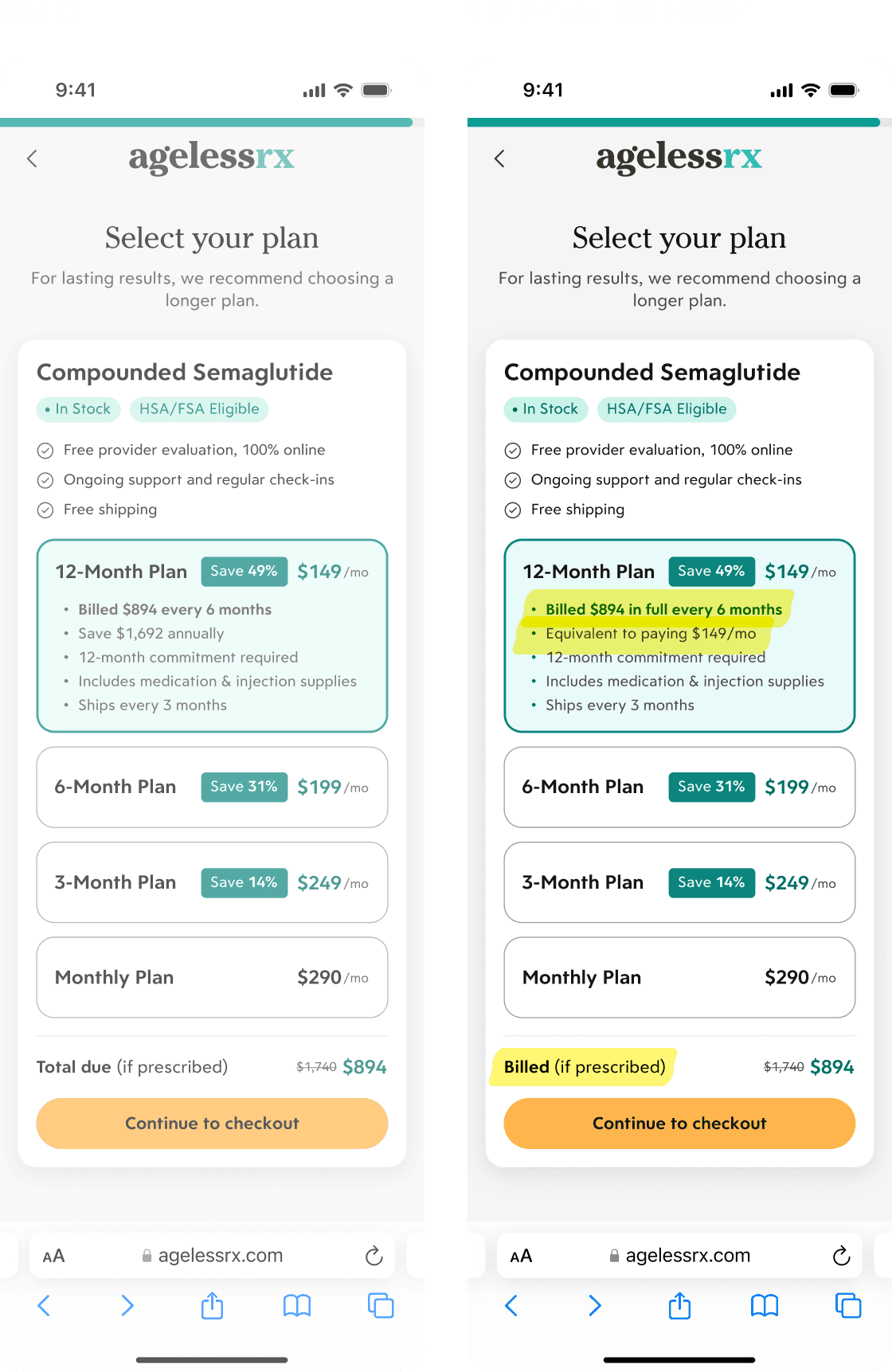
During the experiment, our Customer Experience team flagged that some frustrated patients were requesting refunds on longer subscriptions because they expected to be billed monthly.
“Patients are anchoring to the monthly cost and are surprised by the upfront charge. They feel like we're bait-and-switching them.”
Since we were advertising a starting price of $149/mo, I countered that leading with "$1,194 billed upfront" would create even worse sticker shock without smoothly explaining the billing cadence. After a live design session with Customer Experience, we agreed on a simple solution that addressed their concerns while maintaining UX integrity:
Keep the monthly price prominent (consistent with marketing)
Elevate and adjust clarifying copy: "Billed $X in full" and "Equivalent to paying $X/mo"
This stakeholder collaboration informed how we'd approach price communication for the retention experience — understanding when to emphasize monthly versus total cost.
Despite positive revenue impact (projecting a 17% lift), we decided not to roll out extended plans to new customers.
Supply chain volatility
There was too much uncertainty about fulfillment capability for longer commitments.
Narrow profit margins
The popular 12-month plan (36% uptake) had the lowest profitability, but was essential for our competitive $149/mo positioning.
Regulatory uncertainty
If the FDA pushed back the deadline, the lower conversion on extended plans could hurt potential long-term profits.
Combining all these uncertainties into one rollout was too high-stakes. But we had validated the model, understood friction points, and were ready to apply these learnings to existing customers.
04
Phase 2: Retention
With the FDA deadline just five weeks away, we looked to apply our learnings from the acquisition experiment to help existing patients receive continuous treatment for as long as possible.
Around this time, we welcomed a new designer to the team! Per our tradition of onboarding by fire, she took on repurposing the existing designs to build an upgrade flow for existing customers. I worked with her to refined the designs for launch, incorporating operational changes and stakeholder feedback.

Tailoring to existing customers
The retention flow required us to rethink our requirements. Now, we were designing for users who were already using the product, were sold on the value, and were highly motivated to continue their treatment.
As a result, we were able to make a few key changes that fixed issues we’d faced with the acquisition experiment:
Removed the 12-month plan to steer users toward the more profitable, less risky 6-month plan
Emphasized total billed price (rather than monthly) for maximum transparency, since this traffic wouldn't be seeing the "starting at $149/mo" Google Shopping ads
Focused on messaging the urgency of the looming FDA deadline, prioritizing treatment continuity over cost savings

05
Launch & outcomes
On April 24, a month before the FDA deadline, the subscription extension offering launched to all ~4K of our existing Compounded Semaglutide customers.
Phased communication strategy
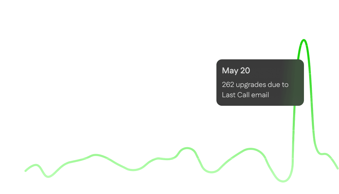
Initially, to avoid overloading our prescribers as they scrambled to handle the influx of upgrade requests, we only notified patients about the upgrade option via their Patient Portal. Once our clinicians gave the go-ahead, Marketing sent out phased emails, allowing monitoring and optimization.
Within two weeks, the clinical review queue was ballooning. With orders getting stuck in a growing backlog, we updated the confirmation page messaging to set realistic expectations about 10-day review times, preventing confusion and reducing support tickets.
By May 16, we had over 1,000 conversions. On May 20, our Marketing team sent out a "Last Call" email, driving 262 orders in one day. Two days later, on the FDA deadline, the change request experience was turned off.
The end result: a huge win for retention
By rolling out extended subscriptions to our existing customers, we exceeded our retention goal by 1.6x and allowed customers to continue receiving care. In an unexpected win, our pharmacies secured enough supply to continue fulfilling these orders well past the cutoff date — as of December 2025, we are still providing treatment for many of these patients.
06
Retrospective
This project was a masterclass in designing under pressure. Working through a regulatory crisis with constantly shifting operational constraints tested everything I'd built and learned over my previous 1.5 years with AgelessRx — the design system, stakeholder relationships, and my ability to test and iterate quickly. I’m proud of all the teams involved for rallying together to exceed our retention goals in such a short amount of time.
What went well
Rapid prototype testing in the first week set us up to move confidently
1.5 years of systems work allowed us to move fast when it mattered most
Applied learnings from the acquisition experiment to existing customers
What I’d do differently
Test mobile designs earlier to better understand conversion drop-off in the acquisition experiment
Nail down commitments and requirements from Operations and Legal earlier on to prevent extra rework
Document decisions/pivots in a shared document and establish a clearer Figma file structure earlier on to prevent confusion with other teams


