This case study is password protected


Context
By October 2024, weight loss had become AgelessRx's most profitable and highest-potential business vertical — and scaling it was the company’s top priority.
As the lead designer on the weight loss category overhaul, I was running parallel initiatives across the funnel: redesigning the weight loss category page, optimizing the product recommendation flow, and building a lead gen quiz. Each project fed into the next.
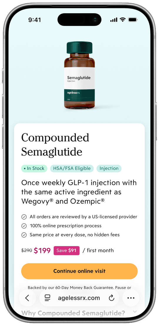
Compounded Semaglutide — an affordable GLP-1 treatment with the same active ingredient as Ozempic & Wegovy — had become a main focus. As one of our top selling products, we were tasked with optimizing Compounded Semaglutide conversion in our treatment recommendation flow.
Timeline
November - December 2024
My Role
As AgelessRx's sole product designer, I owned this project end-to-end — leading user research, testing, and design.
Tools
Figma, Figjam, UserTesting, Miro, Statsig
Team
Product Managers, Marketing, Data & Analytics, Development, Legal
Challenge
In our existing experience, 30% of patients who were recommended Compounded Semaglutide chose to continue with an alternative product. Our existing product detail page wasn't doing the work needed to sell our most effective weight loss treatment.
Our goal was to add 36 unit sales per month by increasing click-through rate on the recommendation page.
01
Discovery
Understanding our baseline
The project kicked off in mid-November 2024 with a two-week discovery sprint.
While my PM dug into funnel analytics, I ran baseline user testing, walking participants through our existing product recommendation page to understand what was working and where we were falling short. What we heard was consistent:
Not enough information to inspire confidence
Confusing product description
Unclear next steps
The one bright spot: our "It's easy to get started" process section was well received — a clear signal that patients wanted process clarity, not just product information.


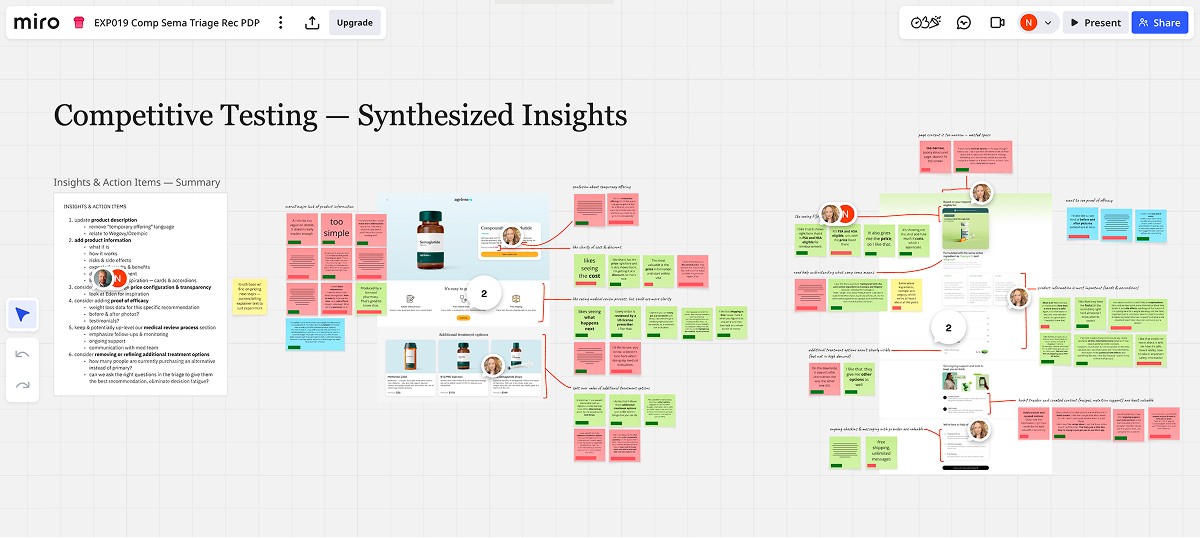
Competitive testing
I also ran competitive testing with equivalent experiences from Hims, Hers, and Eden to reveal the kind of content users were drawn to:
In-depth product information
Explicit Wegovy/Ozempic connection
HSA/FSA eligibility
Ongoing post-purchase support
However, competitor designs left patients wanting more information around effectiveness, which we flagged as a consistent unmet need across the board.
Defining our approach
By the end of our discovery sprint, we felt confident that we could hit our conversion goal by adding trust-building content that users had gravitated to in testing.
Three principles would guide our next steps:
Educate on the offering
Clarify the process
Build trust in providers
02
Design
Initial concepts
In early December, the project entered a formal two-week design sprint. I started by sharing initial design concepts with my PM and the Marketing team, ranging from a rough sketch for conversations around content hierarchy to several hi-fi concepts quickly built using our design system.
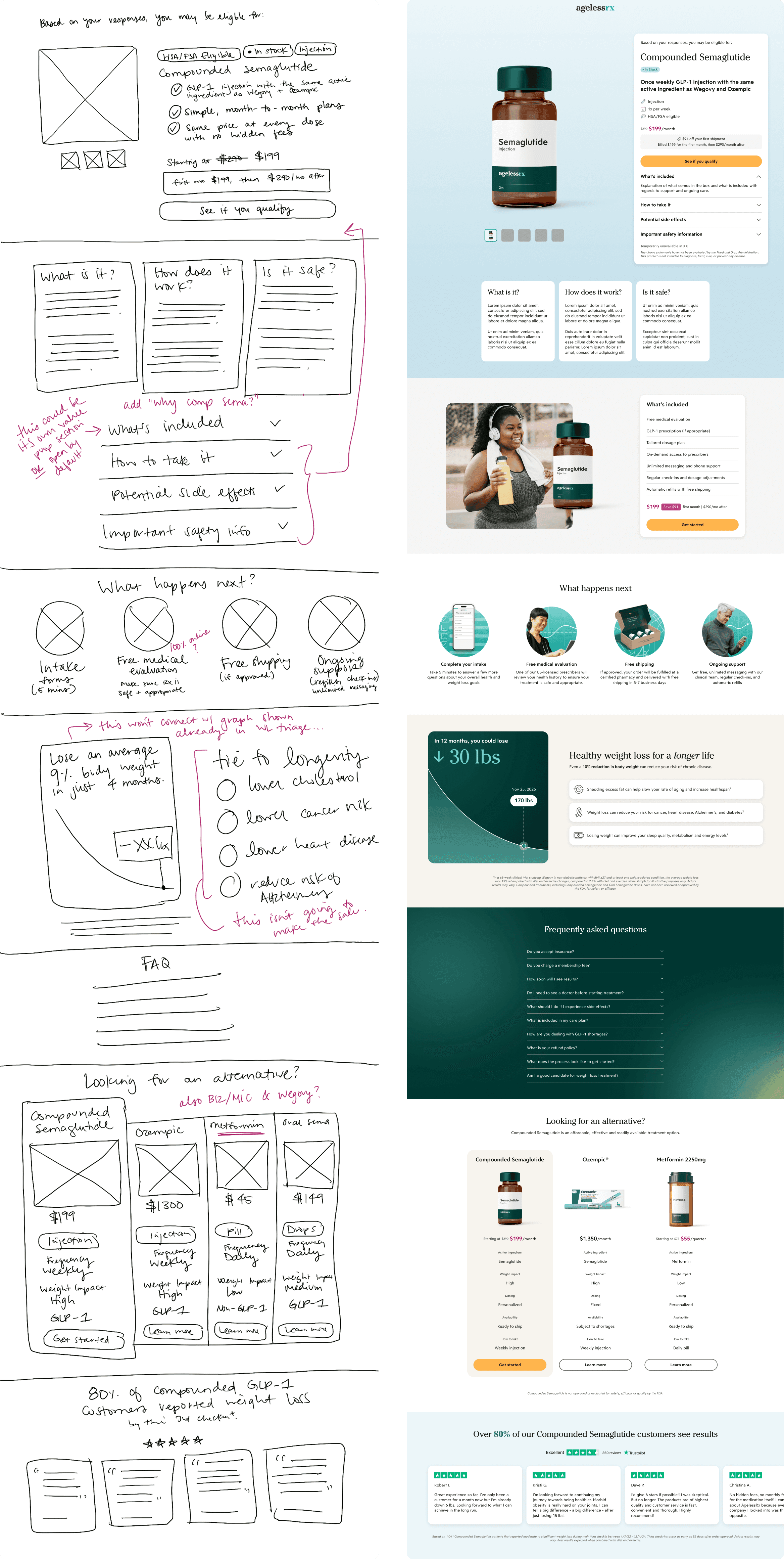

Accordion architecture
The most significant structural change was introducing expandable accordion sections for clinical depth: what Compounded Semaglutide is, how it works, dosing, side effects, and expected results. This let information-seeking patients explore without overwhelming those already ready to move.
Heatmap data from the live experiment later confirmed this: product information drove meaningful scroll depth, validating that patients were curious, not disengaged.
Making strategic comparisons
Rather than presenting alternatives as an afterthought, we designed a structured comparison helping patients understand how Compounded Semaglutide differed from Oral Semaglutide, Metformin, and B12/MIC.
User testing would confirm this increased confidence in the primary recommendation rather than undermining it.

Clarifying our process
A clear, visual step-by-step of what happens after clicking through — health history intake, clinical review, prescription fulfillment — removed the ambiguity about "what comes next" that had surfaced consistently in early testing.

03
Prototype testing
After a week of design exploration, I had gathered and incorporated feedback from key stakeholders on several initial concepts. We were ready to put our latest design in front of users.
I worked with my PM to set up an interactive prototype testing session in UserTesting to simulate the intended end-to-end patient journey from the updated weight loss category page, through the new recommendation flow, to land on our experimental product detail page. Once there, we gathered feedback about:
General impressions
Most and least valuable elements
Their understanding of why they'd been recommended Compounded Semaglutide
Reactions to the FAQ and alternative treatments sections
Any outstanding questions
The response was overwhelmingly positive: Participants felt well-informed, well-prepared, and reassured.
Key takeaways
✅ What landed
Safety & side effect information
The safety and side effect content in particular performed strongly; most participants said it made them feel more comfortable rather than concerned.
Alternative treatments comparison
The alternative treatments comparison chart was the standout moment: 9 out of 10 participants preferred it, citing the sense of agency it gave them.
“I like that it presents different options. I can make my own comparison and I feel like I am part of the decision making.”
✍🏼 What we refined
Why is Compounded Semaglutide right for me?
This section tested well but needed more specific copy, so I worked with our copywriter to make it feel more tailored.
Longevity education
Marketing had advocated for a longevity-focused section, but we removed it after testing revealed it distracted from the purchase decision rather than supporting it.
Finalizing designs
I quickly applied our learnings and incorporated final stakeholder feedback, including a review process with our legal team. At the close of my two-week design sprint, I had polished and annotated designs ready for a smooth handoff to development.

04
Launch & outcomes
We launched the new recommendation page as an A/B test, running for about a month from February 4 – March 7, with traffic split 50/50 between control and variant.
Our strongest results yet
The results were among the strongest our experimentation program had produced. Take rate on Compounded Semaglutide as the recommended product increased significantly (p < 0.0000001 — an exceptionally strong statistical signal).
The variant wasn't just getting more clicks; it was getting patients to follow through on our clinical recommendation.
05
Retrospective
This project reinforced something I've come to believe across my work at AgelessRx: good design has the power to build trust, which is essential in telehealth. Patients arriving at this page already had a personalized recommendation. What they needed next was the right information to feel comfortable acting on it — and that is entirely a design problem to solve.
What went well
Rapid user research and mid-sprint prototype testing gave us strong conviction going into development
Bringing Marketing in early meant the content was on-brand and backed by our key stakeholders from start to finish
What I’d do differently
Confirm test sequencing earlier on, and push to get upstream flows finalized before shipping the resulting recommendation page
Lead with mobile-first prototype testing to better inform final designs — likely looking to reduce scroll length


